Archived article by Patrick Burgoyne from Creative Review Magazine. This is an adaptation of the original piece (published 30/08/2007) sparked by the graphic design of Super Super magazine.
The New Ugly
Following all the debate generated by interviews with Super Super’s Steve Slocombe, here is an article from Creative Review which sets the work into a wider context.
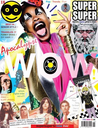
Stretched type, day-glo colours and blatant disregard for the rules: are we witnessing a knee-jerk reaction to the slick sameness of so much design or is this a genuine cultural shift?
In the early 90s, the mother of all rows blew up between, on the one hand, the traditionalist school of American designers led by Massimo Vignelli and, in defiant opposition, the avant garde of Emigre and the Cranbrook Academy of Art. The catalyst was an essay in Eye magazine by Steven Heller entitled Cult of the Ugly, in which the world’s most prolific design writer took Cranbrook and its students to task over, as he saw it, their gratuitously ugly output. Well now, it seems, ugly is back.
Exhibit A: Wolff Olins’ 2012 Olympics logo. When finally wheeled out to confront an ever-more-hostile national press, Wolff Olins creative director Patrick Cox claimed that “Its design is intentionally raw, it doesn’t… ask to be liked very much. It was meant to provoke a response, like the little thorn in the chair that gets you to breathe in, sit up and take notice.”

In addition, Wolff Olins’ chairman Brian Boylan claimed success for having “created something original in a world where it is increasingly difficult to make something different”. In other words, when we are surrounded by logos created to a slick, if mediocre, aesthetic standard, the only way to stand out is deliberately to reject those standards.
Which brings us to... Exhibit B: the magazine that seemingly influenced Wolff Olins’ thinking – style magazine and New Rave progenitor, Super Super. Launched early last year, its art direction has been likened to “a clown being sick”. 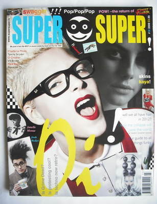 Its wilfully distorted typography, day-glo colours and total rejection of the holy tenets of magazine design are enough to give more mature art directors a fit of the vapours. It’s MySpace made flesh, with all the clashing cacophony that concept brings to mind.
And yet, according to its creative director, Steve Slocombe, what underlines the magazine is “harmony”. “There is nothing in Super Super that is empty or frivolous,” he insists, “everything is there for a reason.”
When it comes to style magazines, Slocombe has form, having previously been editor of Sleazenation.. His last issue there (May 2003 which, incidentally, got him the sack) introduced the freeform approach that Super Super has taken to such troubling extremes. But, he says, it was a period working for photographer Wolfgang Tillmans that most influenced his approach. A fine art graduate from St Martins, Slocombe’s role included helping Tillmans install his shows – a process that was, in itself, an artistic exercise. “We’d get a plan of the space and we’d turn up with work in all kinds of different sizes and respond to the space, arranging the work accordingly: it was an organic process about what work would sit best in certain situations,” he explains.
This, then, is the approach that he brings to designing Super Super. There is no predefined grid: Slocombe starts with the images (which may or may not be in focus) and arranges them so as to maximise the space, just as he and Tillmans would on the gallery wall. There are some rules: copy is set in blocks either 90mm or 40mm wide, at 10 point on 12 point leading or eight on 10, using either Helvetica or Times. But word and image rarely line up: “Things feel a lot more human if they are a fraction out,” Slocombe claims, “it’s about a sense of harmony and rhythm.” It’s what sets Super Super apart: “Magazines had become very machine-like, very impersonal. Super Super is very human. It speaks to the reader very directly, removes the barriers. The values of the magazine are to be fun, to be positive, to say ‘have a go, you can do this’.”
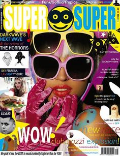 While other magazines may seek to manipulate pace by contrasting full-bleed images with more detailed spreads, Super Super tries to cram in as much as possible onto every available inch of space. The reason, according to Slocombe, is that its readers (typically aged between 14 and 24) are part of the “ADD Generation”. Their alarmingly short attention spans mean that they cannot be guaranteed to look at more than one spread in any particular issue, he claims, so each one has to embody all the values of the magazine. And, he says, they have a completely different idea about colour. If you are 30-plus, white may embody sophistication and expense, but to the Super Super “reader” it is colour that does this – bright colours and lots of them.
The magazine is not, Slocombe insists, anti-design. “That whole argument that you have to be either a follower of David Carson or of the Swiss School is not the debate we have now – I’ll take the best of both and anything else that’s around. The old way of things was movement followed by anti-movement, now the culture swallows the past and moves on instead of defining itself against what has gone before,” he argues. “I’m not against what may have gone before, I just think this is more appropriate for here and now. At the core of the Swiss ideal is efficient communication – well, this is the most appropriate way to communicate to our audience.”
The charitable view would be that Slocombe’s lack of formal design training has left him unencumbered by the profession’s history and therefore more able to seek out new forms of expression: the uncharitable view would be that Super Super is simply a mess, created for young kids who will move on to more sophisticated tastes as they mature. And yet the magazine’s core concerns – of seeking to inject some quirky humanity into a slickly homogenised magazine market, of being true to a vision deemed appropriate to the readership – are shared by a designer with a far more “establishment” pedigree.
In his original essay, Heller slammed those using ugliness as a knee-jerk reaction to the status quo. “Ugliness as its own virtue diminishes all design,” he said. Both projects cited here could be accused of such a crime. However, Heller also argued that ugliness “is not a problem when it is a result of form following function”. Though neither Wolff Olins or Slocombe may feel comfortable with describing their work as ugly, they all lay claim to their pursuit of the latter. 032c. 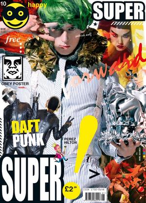
“Making a magazine is about finding the right look for its content, its attitude,” Meiré argues. “To me it’s the only way to create a unique identity. [In doing so] maybe you don’t please the [mainstream] anymore – but you become who you are, authentic in your own way.”
This, it would seem, is the crux of the matter. If all three of these projects, and other contemporary works in the same vein, are merely an attempt to zig while the world zags, to be different for difference’s sake, then they need not detain us for long. If, however, they are the honest result of form following function and thereby represent the visual expression of a genuine cultural shift, then that becomes something altogether more interesting.
Take colour, for instance. Both the Olympics logo and Super Super propose a new relationship between colour and quality. That bright no longer necessarily equals trashy. That a younger generation is inverting the chromatic scale as it relates to notions of quality and class. 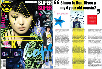 Super Super claims to address the impact of changing patterns of media consumption on design. This, it says, is what happens when your “readers” are not readers at all but mere “scanners” of content who are as likely to start at page 46 as page one. And all three claim to be fired by a desire to involve their audiences rather than simply presenting themselves to them. Inevitably this would seem to require a move away from the slick and the forbidding, toward, as Slocombe describes it, something more “human”.
There is more than empty styling at work here. Something like Super Super can easily be dismissed as just a few kids messing about, but, as a recent piece on New Rave in The Sunday Times Style magazine noted, that’s pretty much how all trends start. All three projects are well-intentioned attempts to respond to and engage with a shifting cultural landscape. If this is the future, it may not be a pretty sight.
;-))