All texts from Deconstructing Product Design by William Lidwell & Gerry Manacsa, 2009, Rockport Publishers Inc.
Variable Balans Stool
Peter Opsvik, 1976
 Peter Opsvik has been rethinking the way people sit since the early 1970s, challenging virtually every assumption of chair design, both form and function, considered sacrosanct by furniture designers. With the Balans, a variation of the word balance, he presses the case that the flaw of traditional chair design is its failure to address the natural urge and ergonomic need to keep moving when seated. Peter Opsvik comments: "If we are able to move, we do. When we stand up, we very rarely ever stay still — we shift our weight around, moving our feet and our arms much more than you ever think. We can walk for hours, but we get tired after only a few minutes if we have to stand still."
- The aesthetic is utilitarian, akin to that of a rocking chair sans the back support, and offers little by way of affective appeal. Assuming the primary sitting position—sitting on the upper pad with knees on the lower pads—is surprisingly intuitive, though entry and exit are cumbersome for the newly initiated and the infirm. The stool is designed to promote movement and variation, not just to be "sat in" or "kneeled in," and accordingly compels the user to self-balance and self-support their posture. It is this "active" paradigm of sitting that is its greatest challenge, as it flies against convention of what sitting is understood to be — that is, resting in a supported position and not moving. Accordingly, appreciating the design is as much a process of education as exposure. The user must buy into the basic proposition that "active sitting" is good for you, even if it isn't always comfortable for you.
- The primary seating surface is large and well padded, parallel to the upright position of the rocker arms. The surface is flat, allowing the user to shift, spin, and slide in and out, though as stated this maneuver requires practice. The kneepads enable users to achieve steeper leaning positions without sliding off the seat than would otherwise be possible with traditional chairs, making it is easier to retain the natural curvature of the lumbar region.
- The two kneepads are appropriately angled, supporting average statures with little or no discomfort, and facilitating changes to leg positions. The kneepads clearly afford having knees and upper shins placed on them, which is one reason many users assume this is the singular manner that one is supposed to sit in the stool. It's not. Rather than trying to promote one Platonic ergonomic posture, the stool aspires to accommodate them all; the premise being that even a highly comfortable position becomes uncomfortable over time. Therefore, users are supposed to actively change their sitting angle and position, sometimes using one versus two kneepads, sometimes using neither. This manner of use is intuitive, but leads many to think that they are working around a design defect versus using the stool as intended.
- The rocker arms support two resting positions, leaning forward and sitting upright, and a third balancing position at the fulcrum. The third position is the most interesting and distinctive, underscoring the "balance inspires movement" philosophy of the design. Used properly, the dynamic balancing and rocking motion is not just healthy, but enjoyable.

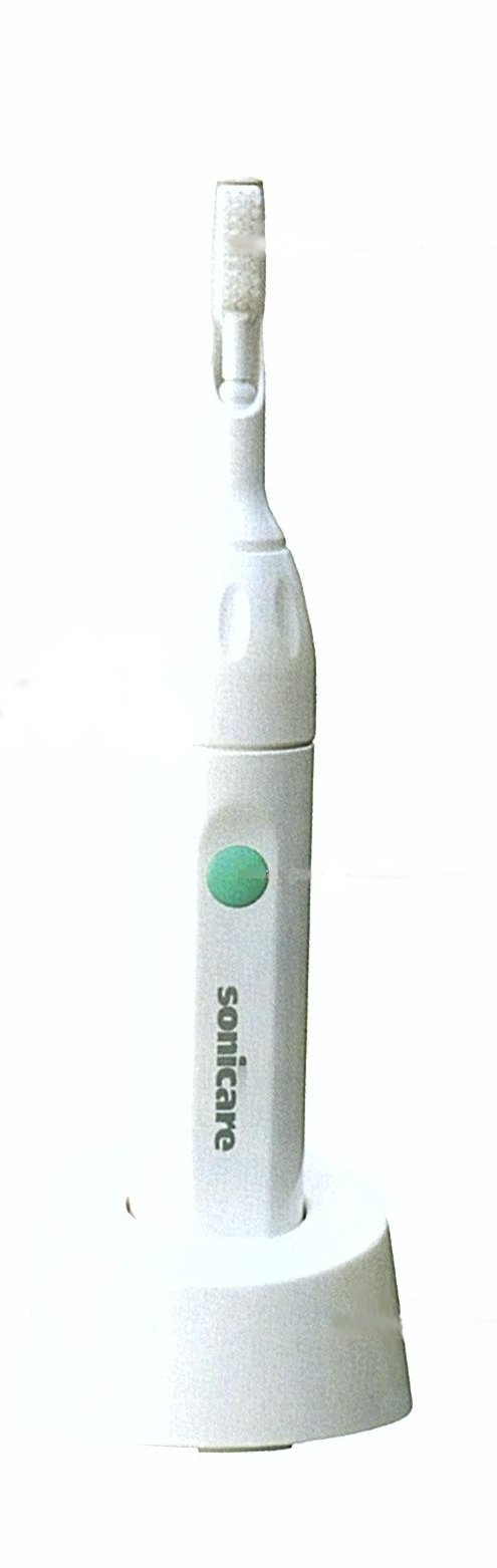 Having had a very personal and painful experience with periodontal disease a few years earlier, David Giuliani was excited to learn about research going on at the University of Washington that studied an improved method of cleaning teeth using sonic technology — a method that not only cleaned teeth better, but that dislodged dental plaque beneath the gums. Giuliani licensed the technology and worked with a small team of designers and engineers for over five years to transform the research technology into a commercially viable product. David Giuliani comments: "We designed the toothbrush to be simple to use. We wanted it to be so natural and so intuitive that there would be no need for an operator manual — no need to translate anything into twelve different languages. So easy that kids could just pick it up and use it. So solid and robust that you could drop it on the floor like a brick and it would continue to function. This is why we used a sealed-case design, with no shafts or exposed mechanical interfaces. The simplicity appealed to users, who could just look at the product and know immediately how to use it. Steve Meginniss, the mechanical engineer who worked on the project, had a philosophy, 'The best part is no part.' This philosophy kept us focused on simplifying mechanisms and eliminating unnecessary elements whenever possible."